Changes in Evaluation Summary Report Graphs
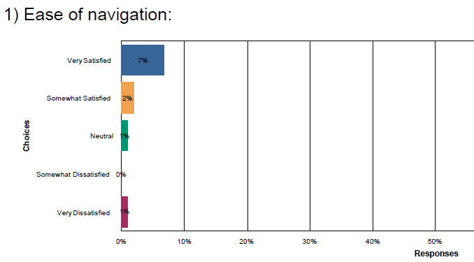
The evaluation summary reports used to portray some data in pie charts. Now all information is displayed in bar graphs, and the percentages included are not percentages of responses, but percentages of enrollees (including those who did not complete the survey, or who may not have completed the product yet). This makes the graph harder to interpret. For instance, "Ease of navigation" appears to have a "very satisfied" rating of only 7%, when actually 64% of respondents rated the ease of navigation as very satisfied. Just wondering why the graphs are now displayed this way, if any other users prefer the old method of displaying data, and if there is any possibility of going back.
-
- Perry Gilbert
1 Response
Thanks! That is helpful. .
